Tutorial Photoshop: Cómo crear y pintar un personaje. #tutorial #photoshop
Sketching up a pose
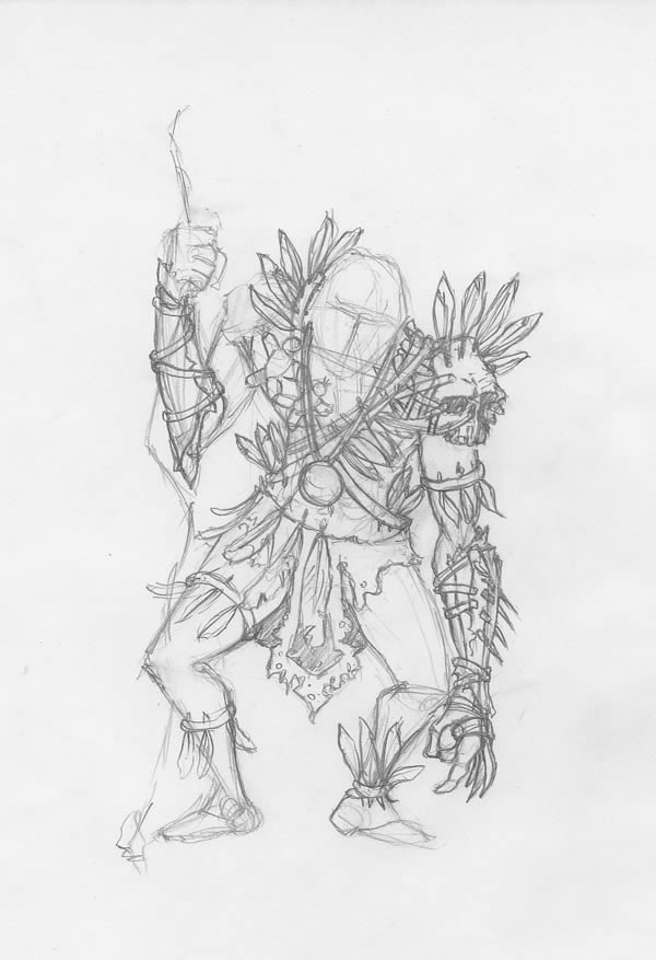
Now we have a detailed description of our character. The only thing left to do (and the most fun) is to bring him to life. First, let’s begin with a pose. No details yet, we just want it to be able to stand up. Like in architectural design, you can’t build a house if you don’t have a solid base to build upon, else everything will collapse.
To start building the sketch, do NOT look into details such as muscles and eyes. Use only straight or slightly curved lines and if possible, only triangles (the simplest shape you can draw!).
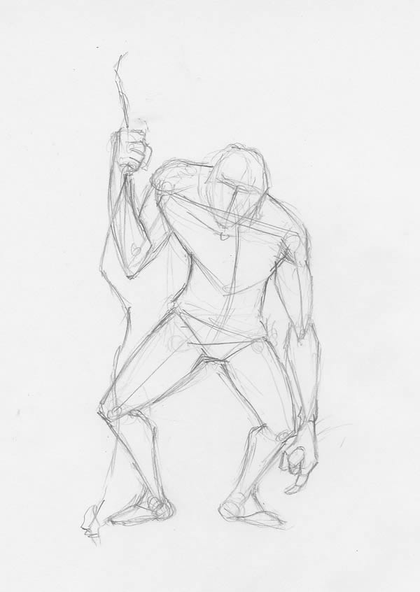

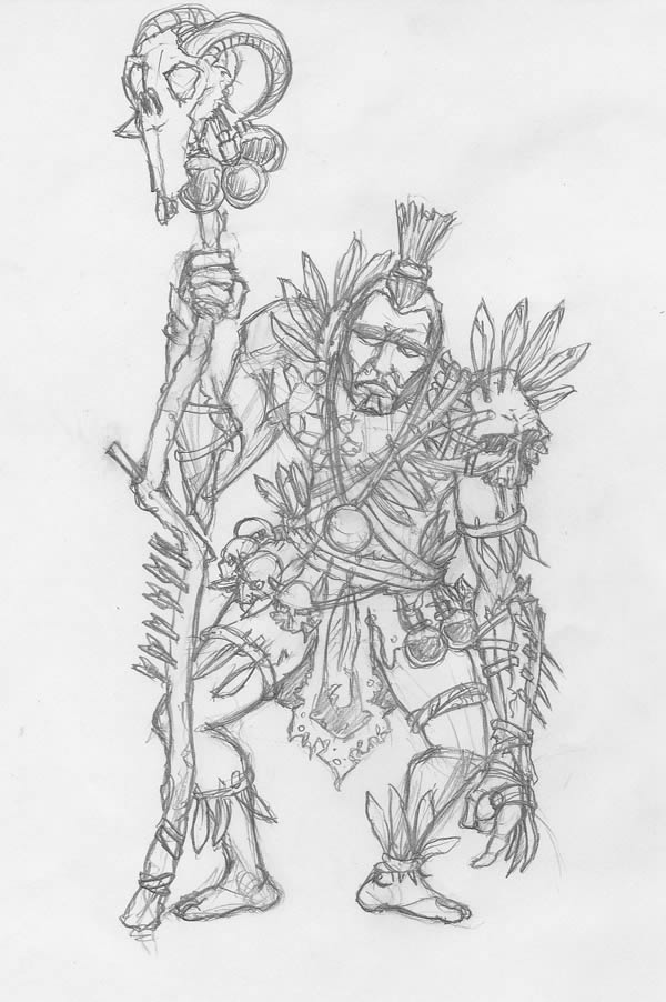
Now we have a solid base to build upon. We will now progressively add details based on the description in our review. Let’s begin. Adding the tribal skirt, made from leather and feathers, tied with a rope. He lives in a natural habitat, so it’s expected for it to be a bit torn and dirty.
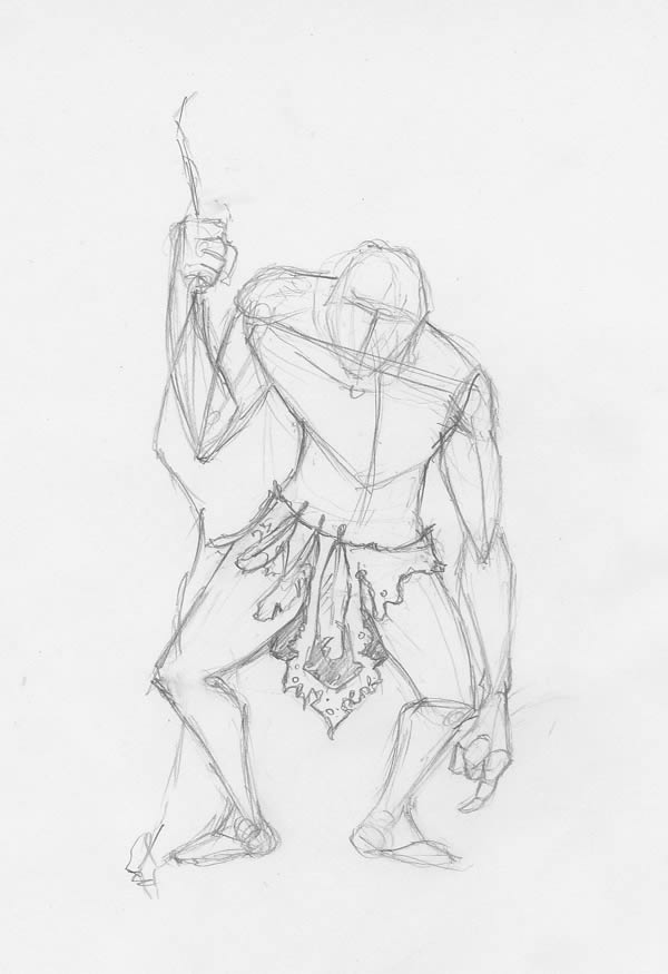

Move on to the rope harness with feathers and teeth. Also add the pendant, so you don’t have to erase too much afterwards.
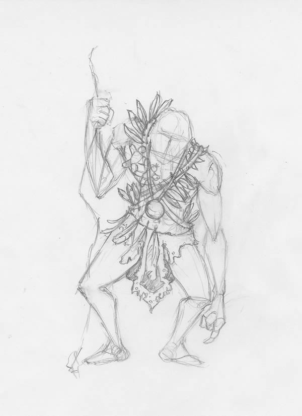

Up next, the shoulder and arm bands, with the poisoned darts and claws.
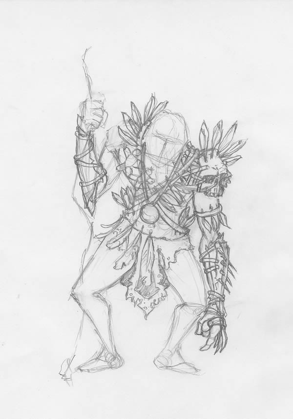

Add more rope on his feet, but try not make them symmetric. He is a tribesman, he doesn’t care for perfection.

And last, the gnarled staff, the face, skulls and potions.

Step 1
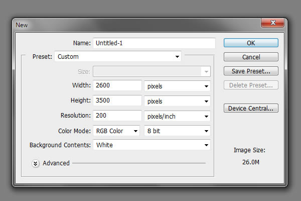
Now you can scan your paper sketch (use a 300 dpi setting for your scanner) and let’s begin the fun part! We need a relatively large document of we want to draw all those details, so a 2600 x 3500 px at 200 dpi will do just fine. Go to File > New and use the setting from the image below.

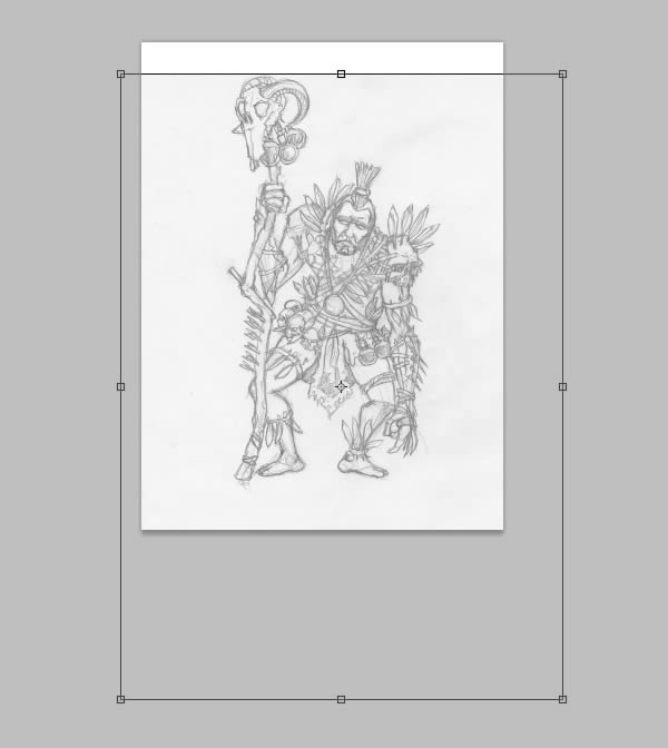
Add the paper sketch, we’ll need a clean outline and we’ll trace it.
Open the sketch, go to Select > All (Command/Ctrl + A), copy it (Command/Ctrl + C), go back to our document (Command/Ctrl + V) and hit Enter. Hit Command/Ctrl + T (Free Transform mode), resize it to fit the canvas, just like below. Hit Enter to exit Free Transform mode.

Let’s make it a bit faded, so we can see the outline we will draw next.
In the Layers palette, reduce the Opacity setting to 30%.
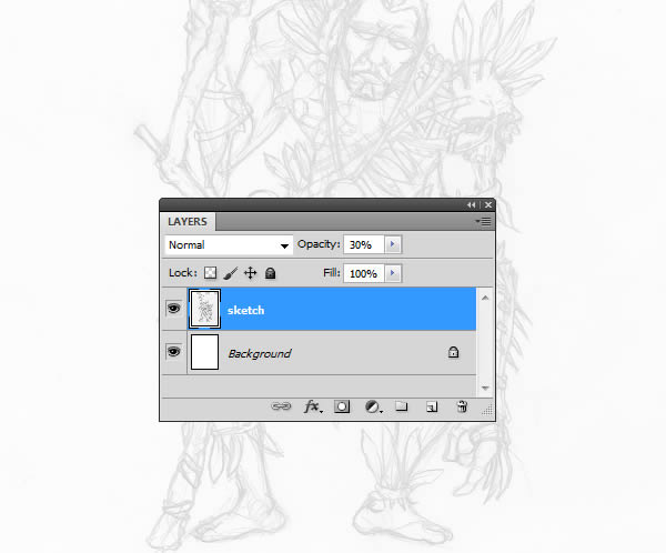

We’ll need a new layer to create a clean outline.
Go to Layer > New > Layer (Command/Ctrl + Shift + N) and name it “outline”.
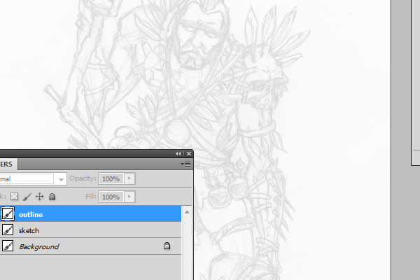

We’ll also need a set of custom-made brushes, the default ones are not very useful.
Go to Window > Brushes (F5) and use the settings shown below for the brush presets.
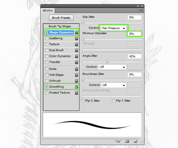

Save this brush to the presets, so we can easily select it later on.
In the Brushes palette, select the Brush Tool (B), access the palette menu and select “New Brush Preset”.
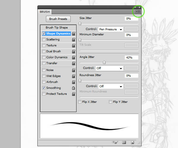

Step 2
Select the brush, then start tracing the sketch using a dark brown color. Don’t bother creating closed shapes.
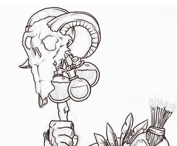

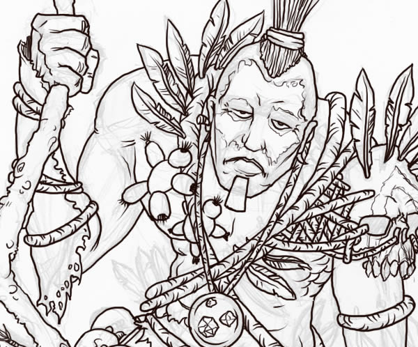

Now you’re probably wondering “Ok, I will trace the image, but how do I draw all those elements and textures?” Don’t panic, the following images will clearly explain how to draw each.
Skulls are one of the coolest things you can learn to draw. So let’s start with that.
They are actually easy to draw, once you’ve memorized the basic elements that define its shape: eye sockets, nose and teeth.
Here’s an example of a skull drawn only with power lines. You can tell it’s a skull even if you step 4 feet away, yet only a few lines are present.
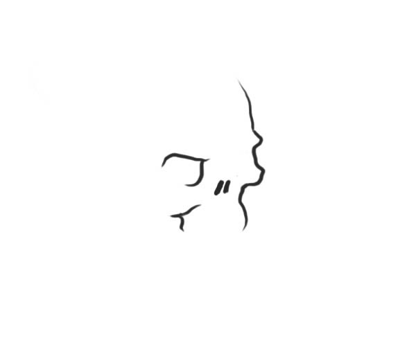

Remember one thing: every shape has, at its origins, a very simple shape that defines it. The rest are just details around it. In this case, our shape is an oval. The darkened perspective cross represents the simplified version of the eyes and nose.
The second important lines are the ones defining the eye sockets. Keep in mind they are holes in a sphere, so draw them using curved oval shapes.
Next, exaggerate the eyebrows and cheekbones, make him look angry. Realistic skulls have a “smiling” expression and we don’t want that for our design.
When you draw the teeth, use rhomboidal shapes, not your average rounded rectangles. Sharp corners suggest aggressiveness.
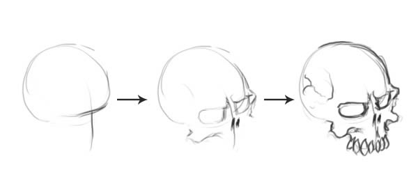

Follow the same guidelines for the other elements: feathers, rope, bones wood, hair and bottles: find the “power lines”, the rest will follow by itself.
There’s an alternative to this step: I’ve attached a vector skull’s outline, you can use that one if you’re having trouble with drawing skulls.
Here’s the drawing process for the feathers.
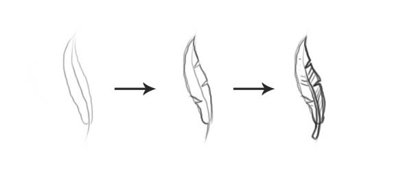

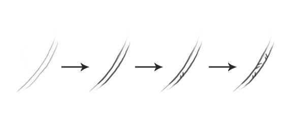
Next, the rope.
The only trick to this is just to draw slightly curved, oblique pairs of lines along the shape.

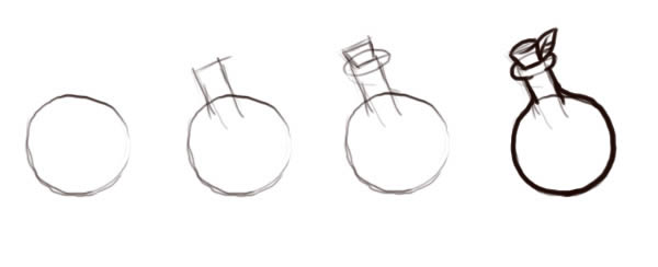
Flasks have a spherical shape, with a long neck, similar to a lab flask. Don’t have one? Your friend, Google, is there for you, look up for one 🙂
Start from a simple shape and build up details, step by step.

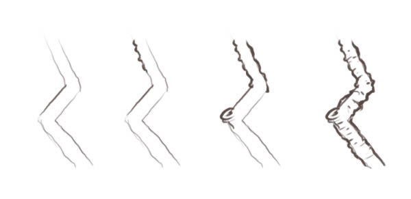
Wood is also quite simple to texture. We know the staff is made from an old stick, so it will have an irregular surface. From extended contact with dust and humidity, the lower end also has some cracks.
Again, start with the basic shape. Move on to drawing rounded, irregular shapes along these lines, mostly small lines in a “C” shape. Don’t forget to add those wood knots!

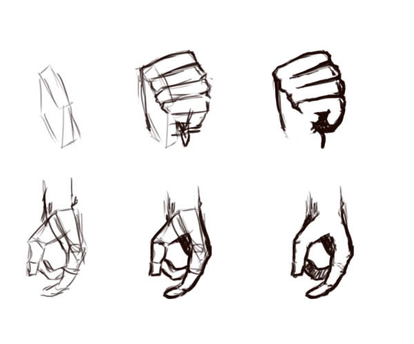
I’m sure you got to the point where you need to draw the hands and thought “God, I hate this part!” Don’t freak out, I’m here to explain.
Use your own hand as reference. Think of it as built from basic blocks and rectangles: you’ll have a trapezoidal block for the palm and “tubes” for each finger.
Also, observe the proportions between them, starting with the middle finger. It’s the longest and built from three different segments. The ring and small finger are a smaller and in most cases, they follow the middle finger’s position. Don’t believe me? Try pointing at your monitor with each finger. When you point with the ring and the small fingers, you have to hold your middle finger with your thumb, right?
Use this knowledge to create a natural pose for the fingers.

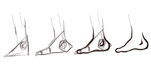
Feet are also a pain to draw, given the fact you’re trying to put in the line art directly. Here’s how to do it, in case your sketch is not very accurate.
Build blocks and use references. There is nothing wrong or shameful if you are using them, use as much and as many as you can. If you have an artistic anatomy manual at hand, this will be even easier to do.

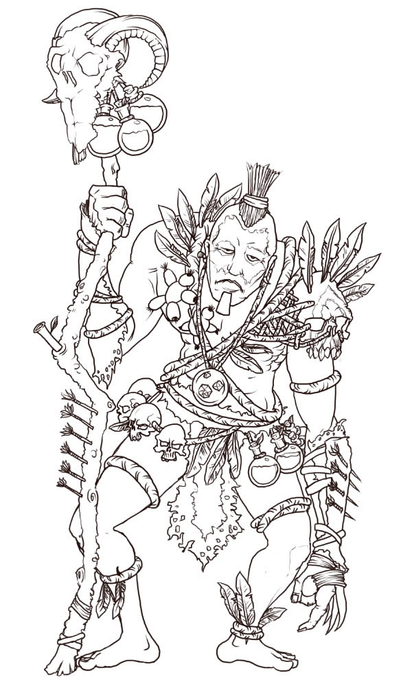
Now you have enough info to finish the lineart. But just in case you want to go directly to coloring, there’s a separate file with the line art you can use 🙂

Step 3
As you may have noticed, some parts shown in the sketch are no longer present or appear slightly modified. Read the following list to learn why this was necessary.
- The beard is now larger, more “tribal” and makes the figure stand out a bit more;
- The animal teeth on the rope are gone – the line art became encumbered with details. Now, that area is now a resting place and the viewer can absorb the details around it a lot easier;
- Some feathers on the harness are also gone, for the same reason as the animal teeth. The feathers on the sides were occupying too much negative space and made the body look stiff.
- On arms and legs, the number of feathers are reduced. The remaining feathers are just enough, there’s no need to burden those areas with more details.
- The darts now have an irregular feather shape, instead of that clean look, like the modern arrows have.
- Tribal paints are also removed, there are enough colors as it is. Feel free to add them if you want to.
Step 4
Select the “outline” layer, lock it and create a new layer (Command/Ctrl + Shift + N or Layer > New > Layer). Name it “skin base”. We start with the body, then build up stuff around it. For each color we add, we will create a new layer, so try to keep in mind the “New Layer” shortcut keys.
We’ll need a color palette to work with.
Create another layer, name it “palette” and hit Command/Ctrl + Shift + ] (bracket) to place it above all the other layers. We’ll create the color palettes on it. Don’t worry, I’ll show you how to do it.
If you have a set of skin tone swatches at hand, it would be great. If not, you can always go “by feel”. An alternative solution is to use the palette included in the .PSD file.
Our witch doctor is from an African tribe, let’s make a color palette for that skin color.
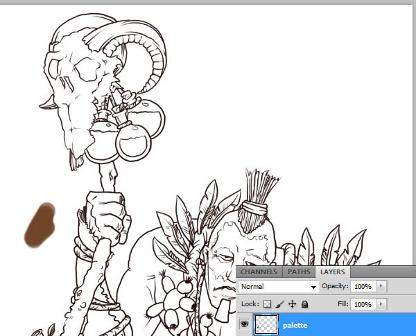
Double-click on the Foreground color and select a mid-tone brown, like below.
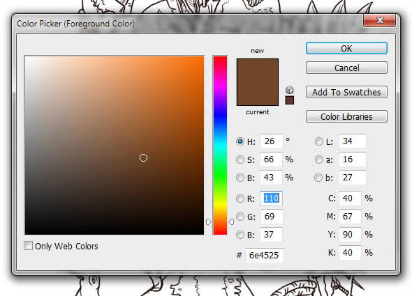

Hit OK, grab the Brush Tool (B) and paint a spot on the “palette” layer. Tap the “]” key to increase the brush size.

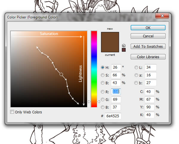
To create darker and lighter tones, double-click the foreground color and select tones, following the schematic below. Here’s a neat trick: for lighter colors, pick more desaturated colors and for shadows, pick saturated colors.

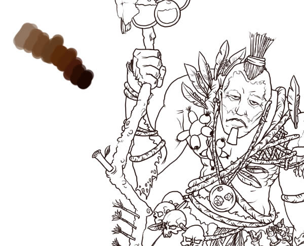
This is how the palette should look like after you place in all the colors. It’s not always necessary to add that many colors, but who knows when you’ll need one?

Create another layer, name it “skin base”, place it below the “outline layer. Also, click the “Lock position” button. This command will prevent any accidental displacement of the layer (yes, it may happen and you may notice it too late).
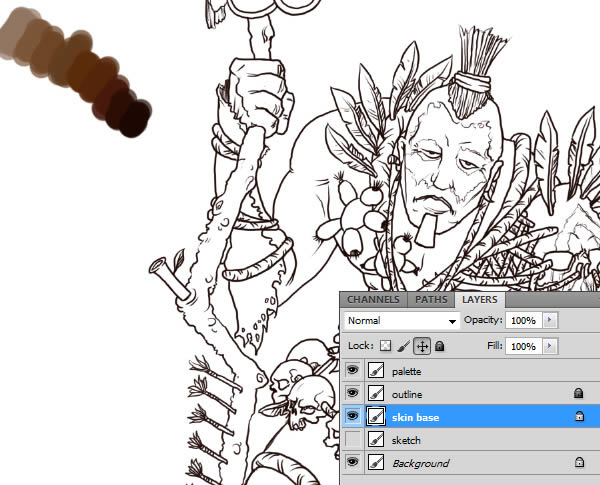

Grab the Brush Tool (B), select the brush we created and start filling in the body with the first color. Use “[” and “]” to decrease/increase the brush size. This is how it should look so far.
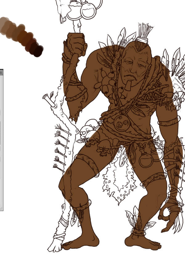

Next, the rope. As before, create a palette, a new layer labeled “rope base” and fill in the outlines.
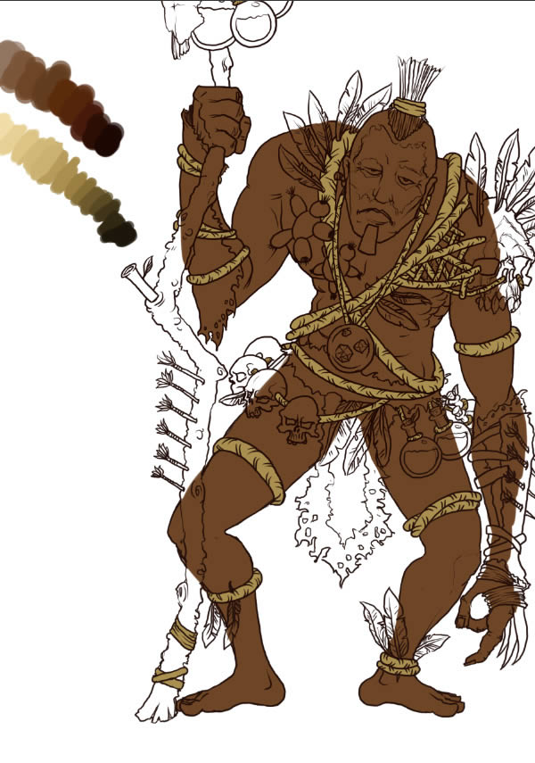

Feathers should be colorful. So I’ve decided to add bright orange and green tones. Again, create a color palette and fill in the outlines. Where you place the tones is up to you, there’s no specific order.
As before, create new layer and name it “feather base”.
Now the colors are adding up and the white background will have a great influence on your decision to pick colors. I suggest you fill the “background” layer with a mid-tone color, preferably neutral (gray will do nicely).
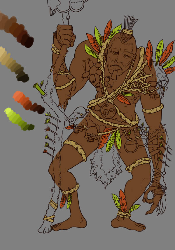

Next, the leather dress. You know the drill: new layer, name it “leather base”, place it above the “skin base” layer and fill in the base color. For this one, I used the palette from the skin, but chose a darker base color.
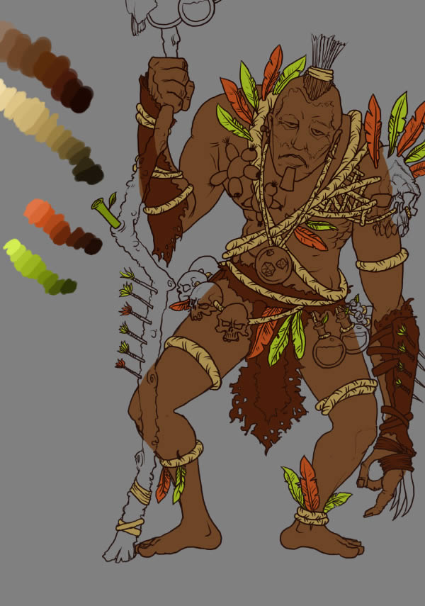

Repeat these steps for the staff, bones, hair, Voodoo dolls and flasks.
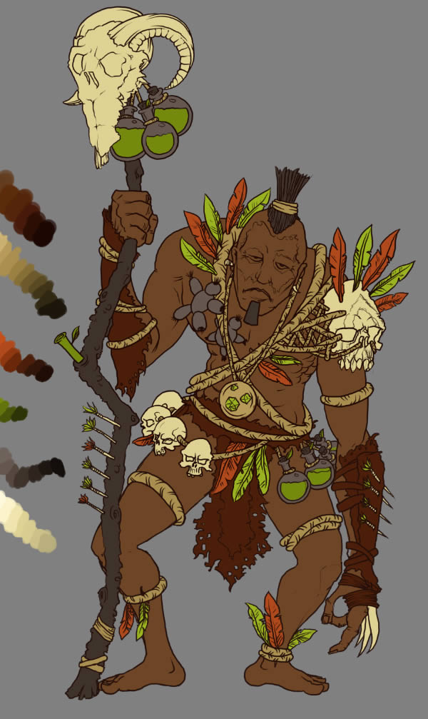

Step 5
First, choose the position of the light source. Remember it or make a visible mark on a separate layer, your choice. This step is very important, because it will influence the positions of shadows and highlights and in some cases, the difficulty of rendering them properly.
Select the “skin base” layer, create a new layer, name it “Shadows 1” and ALT + click between it and the “skin base” layer. This will create a clipping mask – you’ll be able to draw only within the surface of the base color.
To select a color from the palette, have the Brush Tool (B) selected, hold the ALT key and click a color.
Now you’re ready to lay down the first set of shadows. Grab the Brush Tool (B) and paint in the shadows. If you’re having trouble with these, ask someone to stand facing away from a window and take a picture. That will be your reference image.
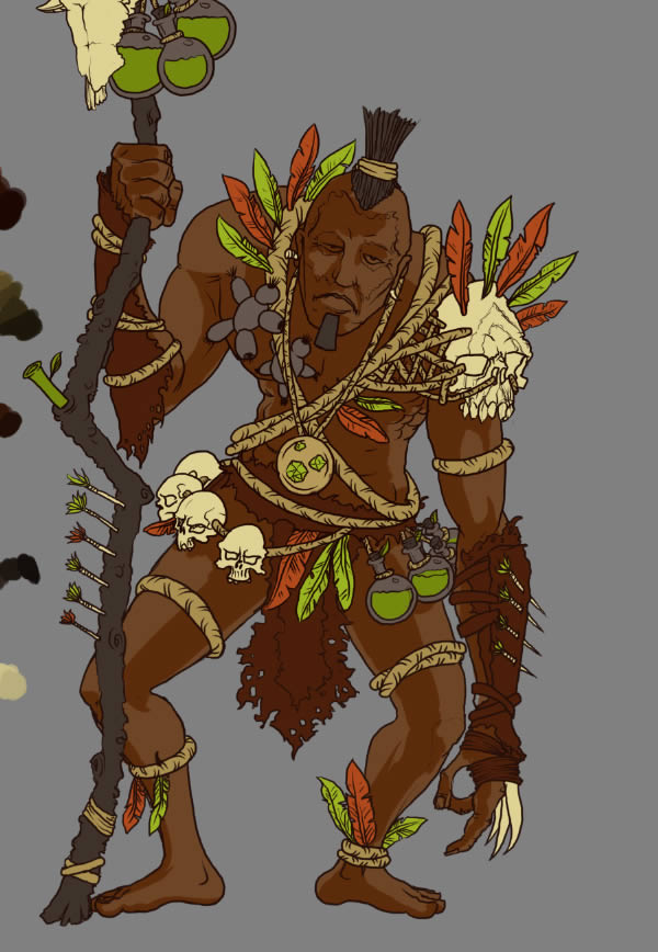

Lay more “shadow” layers until you have enough contrast. Four or five layers should do nicely.
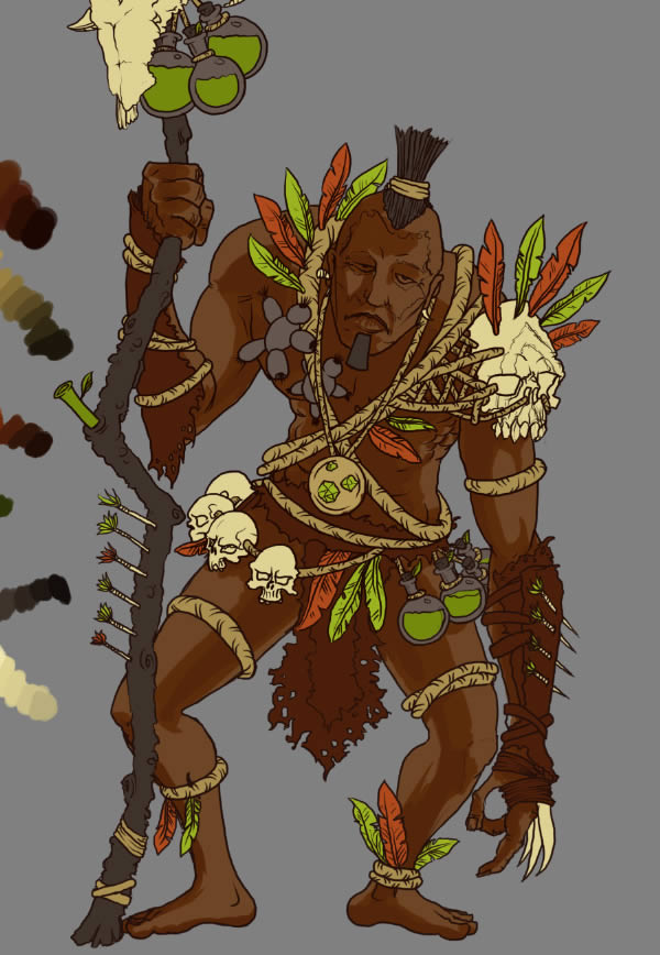

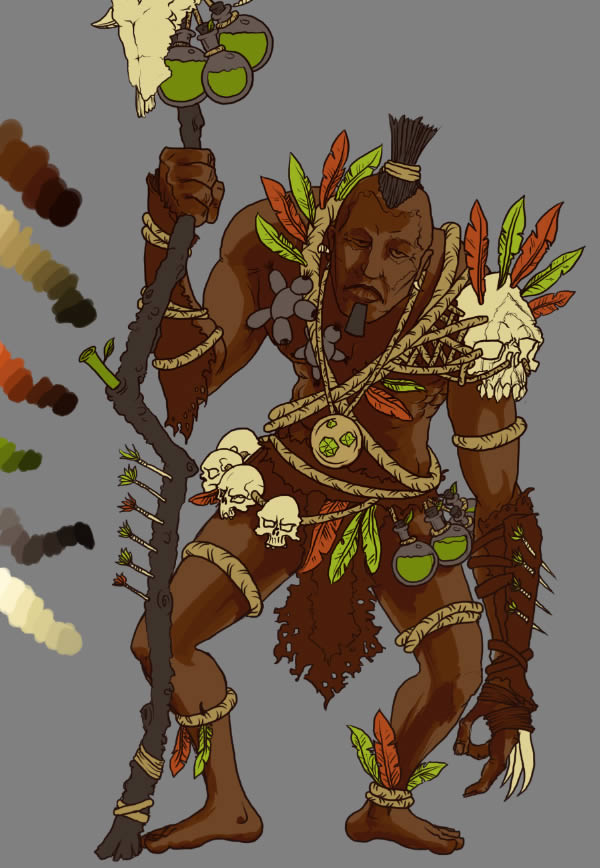

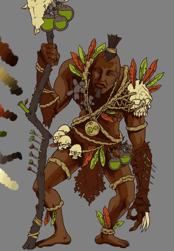

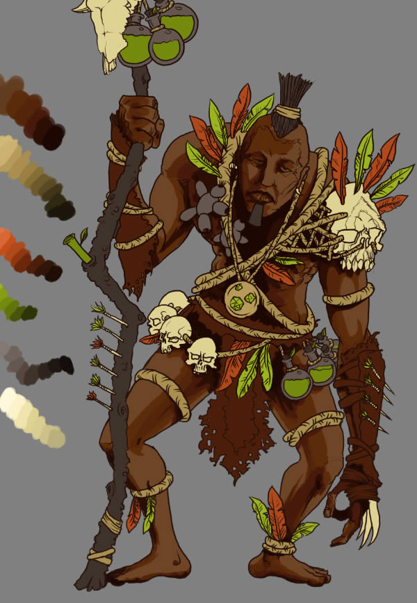

Now for some highlights. It’s basically the same, but this time, you lay down lighter colors. For this part, two or three layers are enough. Label them “Light 1”, “Light 2” and so on.
Your layers now look like this. In my Layers palette, you see that the “base” layers are colored in blue. This is a handy trick to keep track of some layers, in case you have too many. To do this, select the layer, right-click the “eye” and select a color.
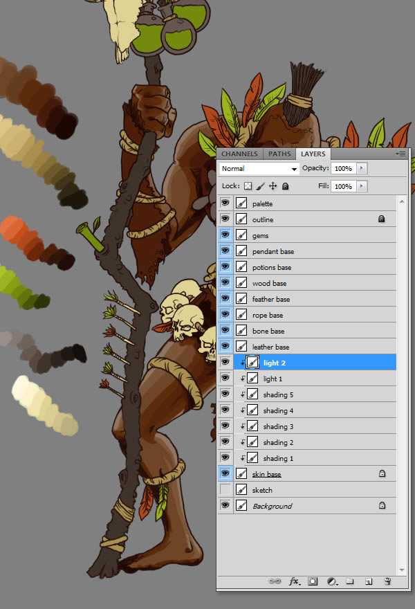

Let’s repeat the process for the other elements, shall we?
Note: In the following screenshots, I’ve isolated the changes with grayed areas. This for observational purposes only, yours won’t be like this.
The leather is already dark, we’ll use three colors for shadows and two for highlights.
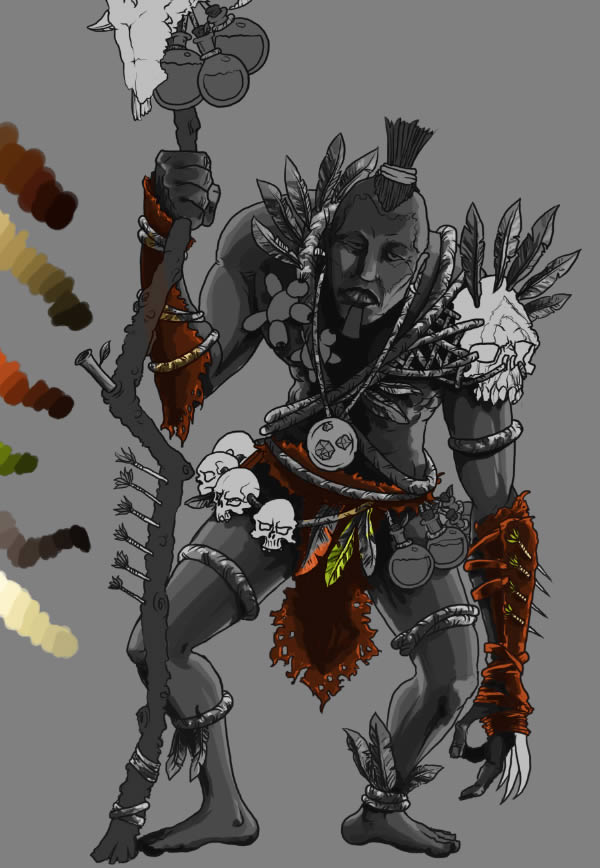

Bones will have a light yellow tint. We’ll use five colors for shadows (using many dark tones for light base colors will allow us to add lots of contrast) and one for highlights.
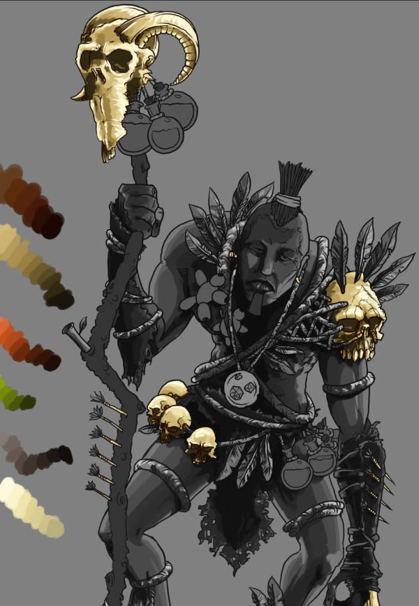

Rope will do just nicely with two colors for shadows and one for highlights. It’s a thin object, so we don’t have to render every detail.
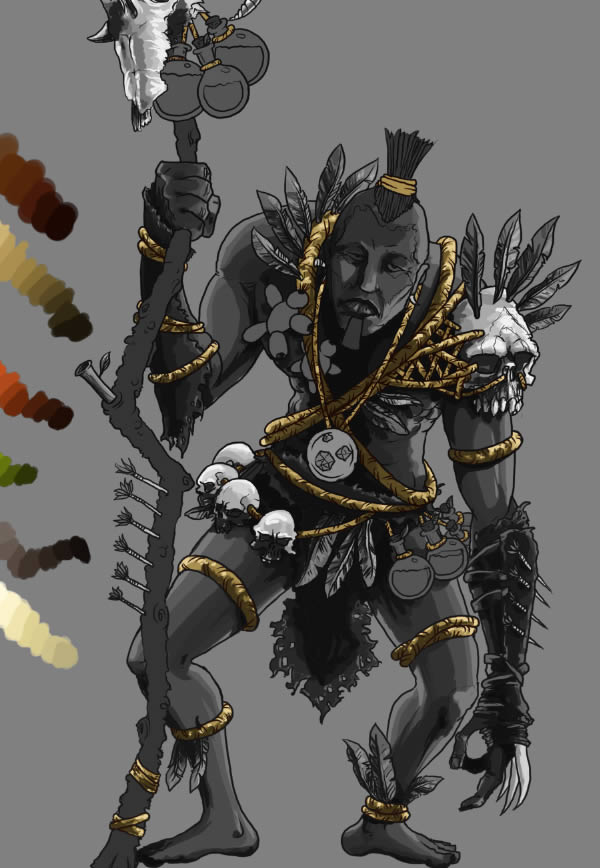

The staff is also thin, so two layers for each would do nicely. I’ve also included the hair on this layer, since it has a similar tone.
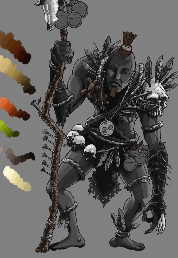

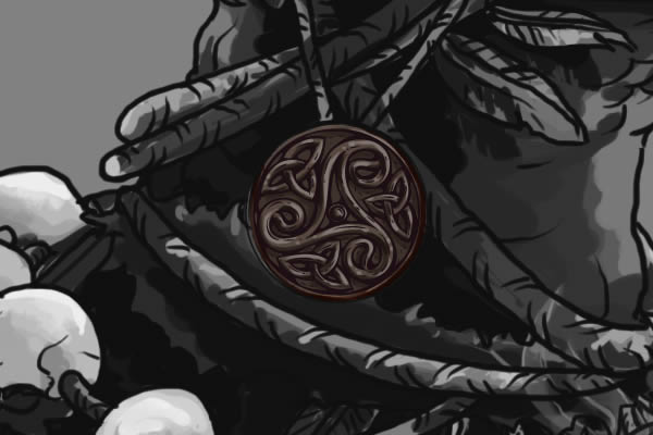
Although a small detail, the pendant also requires some attention. Three layers for shadow and one layer for highlights would do just fine. Either you draw it yourself or you can use the vector triskelion provided in the source file.
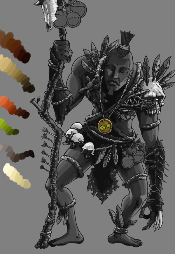

Here’s the alternate version.

The flasks contain a green, glowing liquid. Let’s make them interesting!
Add two layers of shadows, painting on the upper and middle sides of the flasks.
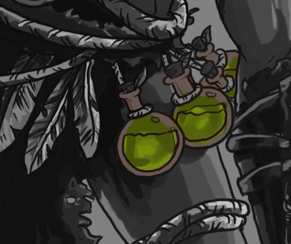

On a “light” layer, draw some swirly light green shapes.
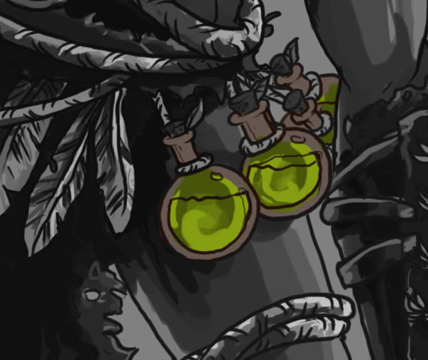

Add another “light” layer and small lines and dots.
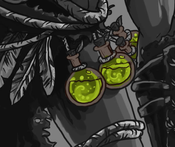

The final touch are some light green dots. Draw them as highlights for the previous layer.
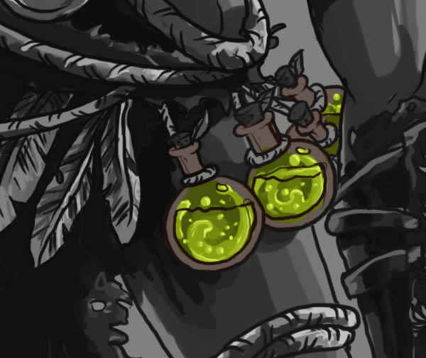

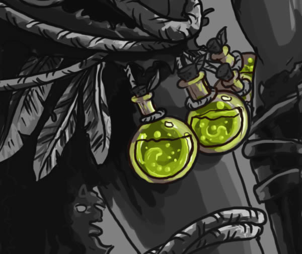

So far, our character looks like this and as you may have noticed, there are many layers now. Aren’t you glad you’ve colored those “base” layers? Now it’s easy to browse through them.
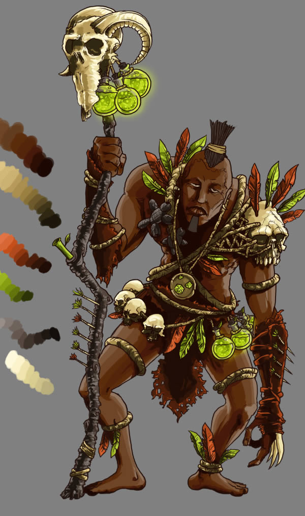

Step 6
And now, the bane of digital drawing, the color blending. This can be a very tedious process and can absorb many hours for detailed artwork. But let’s simplify this process a bit, and you can take it further if you’d like to.
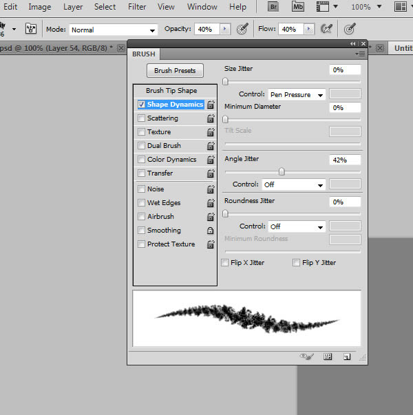
Open the Brushes palette (F5), select the Brush Tool, select a charcoal brush and check the “Shape dynamics” setting.
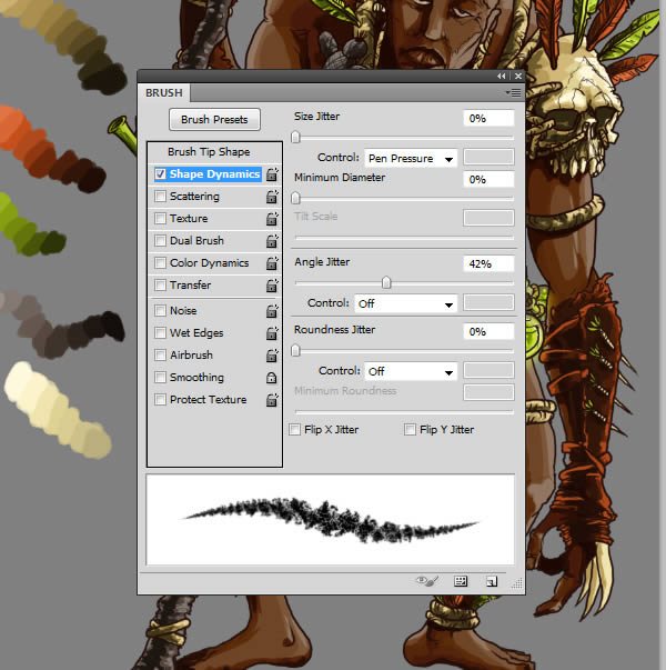

Set its size to about 35-36 px and create a new brush, just like the first. Name it “Blend”. Select this brush, hit “4” to set its Opacity to 40% and Shift + 4 to set Flow to 40%.

Let’s start blending in colors, starting with the skin.
Select the top-most “light” layer from the “skin base” layer, create a new layer (Command/Ctrl + Shift + N) and name it “blends”. ALT-click to make a clipping mask.
Grab the brush we’ve created, hold the ALT key, click a color and paint over the color transitions. Repeat the ALT + click command for each color.
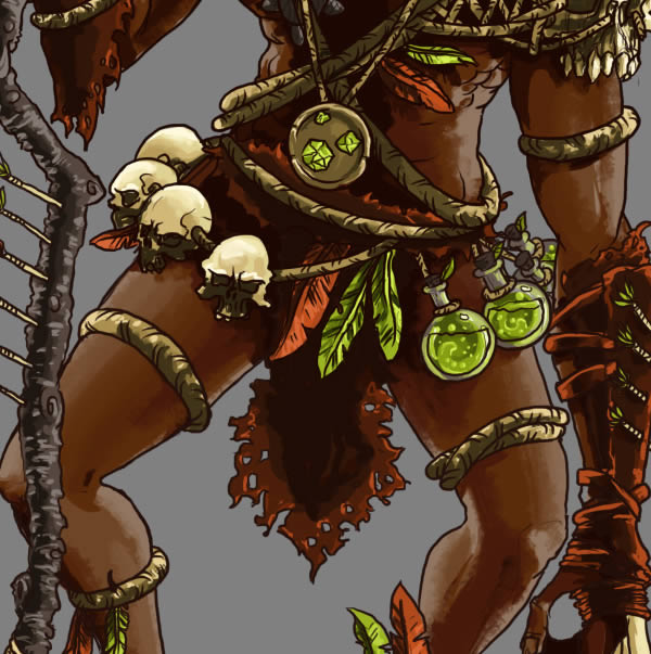

The process is similar for the other elements: new layer, clipping mask, ALT + click to pick adjacent colors, paint over color transitions.
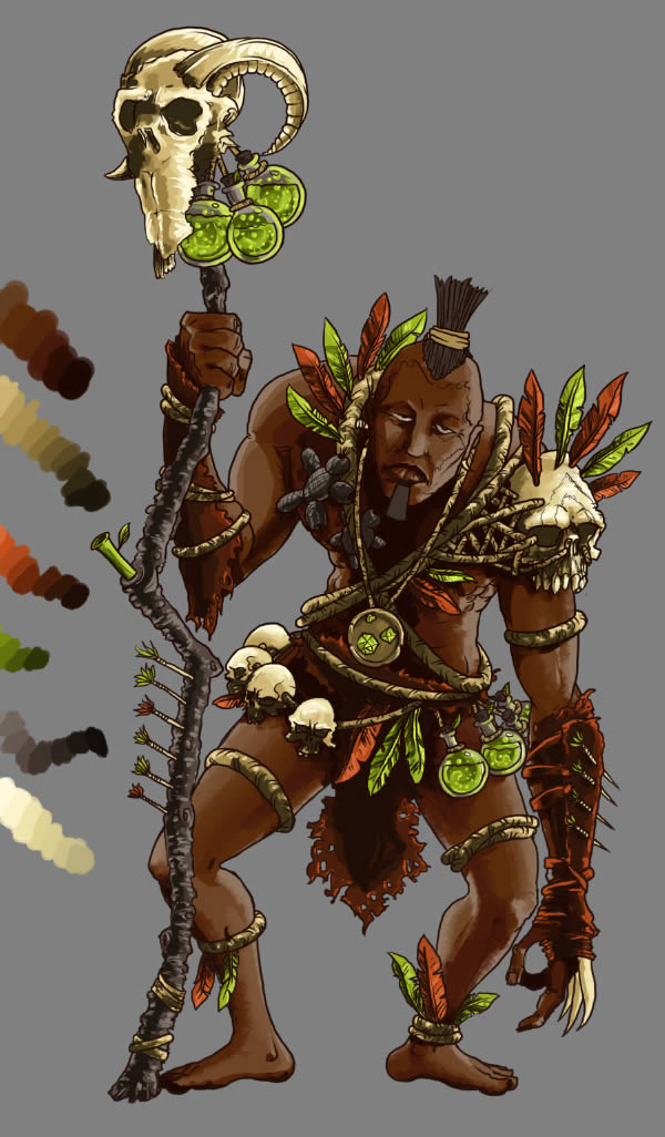

Step 7
We’ve set in colors, but we also need them to interact with one another. The potions are glowing, so we’ll have green lights casting all over the place. It’s also a good technique to blend multiple objects in the same picture (grab colors from one object and paint them on another). Let’s render those, shall we?
Create a new layer and hit Command/Ctrl + Shift + ] to make it the top-most layer and name it “environment lighting”. From the palette, grab the lightest green, grab the first brush, set its Opacity to 20% and paint over the areas where the light is cast.
On the shoulder, hand, face, Voodoo dolls and hair.
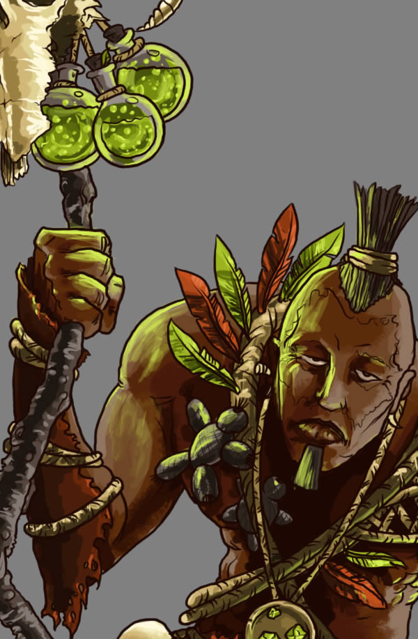

On the left hand, thighs, body and ropes. Don’t forget to create blends for this light, also.
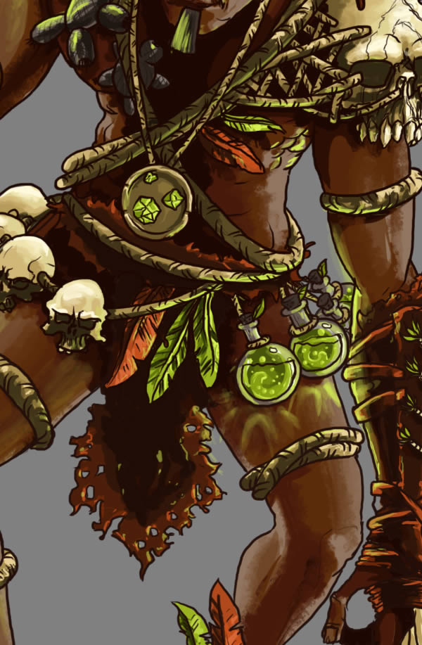

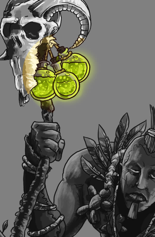
A glow on the flasks would be nice, don’t you think so?
Create a new layer above the “Light” layers for the “flasks base”, grab a soft round brush and paint over them. Set the layer’s Blending mode to “Soft Light”.

Step 8
I’ve decided to add a small smoke coming out of the flasks. Here’s how to draw them!
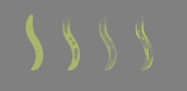

Turn off the visibility of the “background” and “palette” layers. Now select the top-most layer and hit Command/Ctrl + ALT + Shift + E.
This will create a merged version of what you’ve drawn so far.
Now open a grungy texture (rust, concrete, metal or the one provided), select all (Command/Ctrl + A), copy it (Command/Ctrl + C), go back to our document (Command/Ctrl + Tab) and paste it in. Desaturate it (Command/Ctrl + Shift + U), set its Blending mode to Soft Light and 35% Opacity.
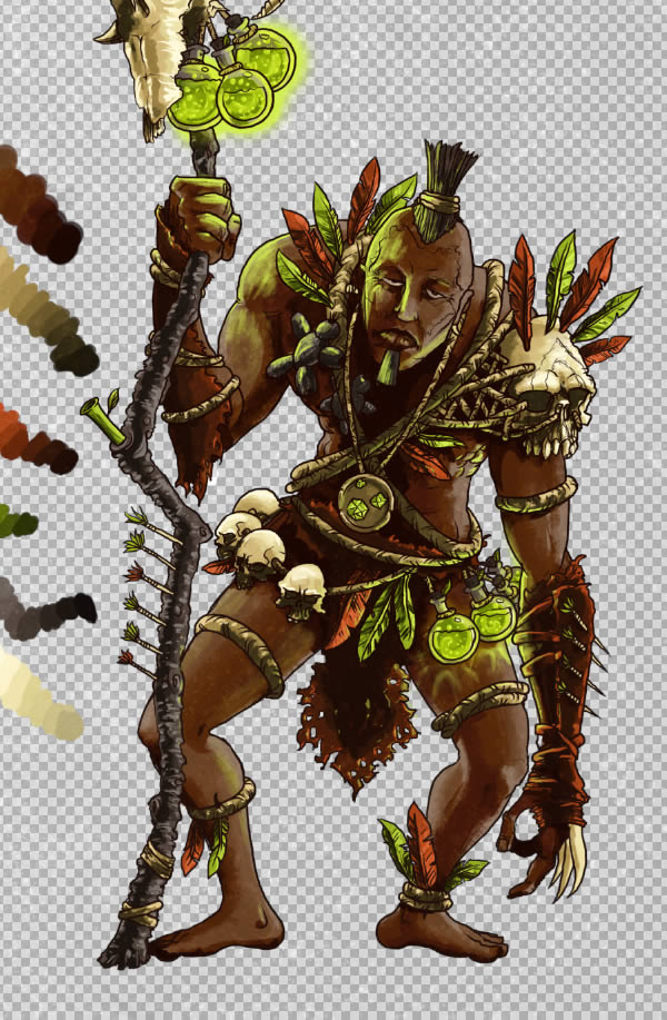

Command/Ctrl + click the layer below and go to Layer > Layer Mask > Reveal All. You can now turn on the visibility of the “background” and “palette” layers.
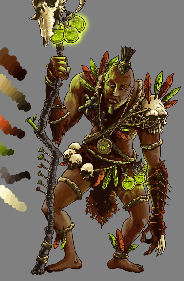

Let’s create some mood for our character.
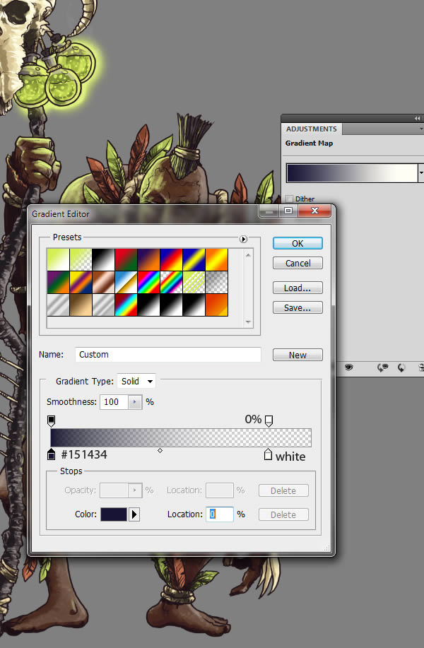
In the Layers palette, click the “eclipse” icon and select “Gradient Map” and set its Opacity to 30%. Use the settings below. Hold the ALT key and click-drag the layer mask from the texture onto the adjustment layer. Click on the gradient and use the settings below.

Conclusion
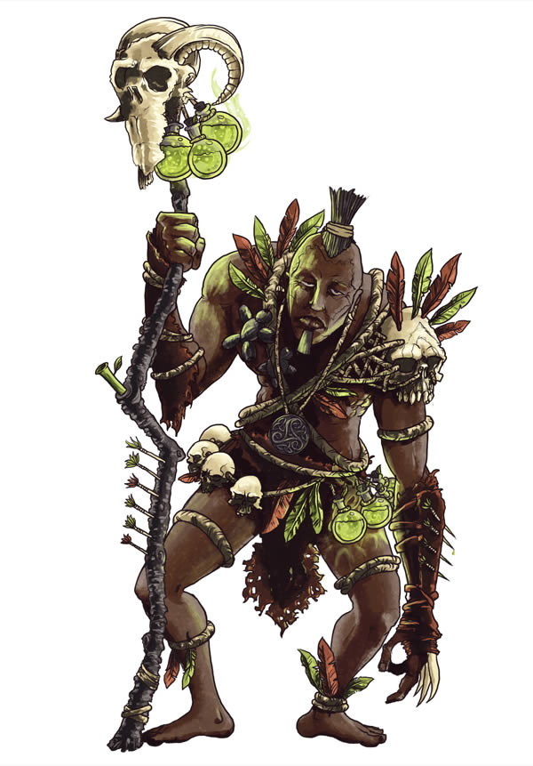
And after all this work, the final image looks like this:


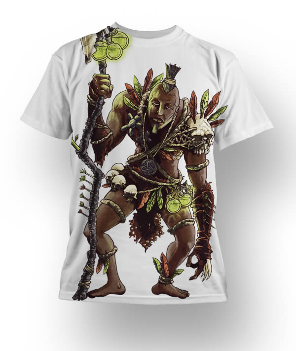
Now you’ve put so much effort into drawing this, so why not print it on your T-shirt? It would look like this:



Finalidad » Realizar la gestión administrativa, contable y fiscal, así como enviarle comunicaciones comerciales sobre nuestros productos y servicios, finalidades relacionadas como usuario de los servicios que brindamos en nuestra página web https://www.elrincondelombok.com
Legitimación »
- Ejecución de un contrato.
- Interés legítimo del Responsable.
- Consentimiento del interesado.
Destinatarios » Están previstas cesiones de datos a: Administración públicacon competencia en la materia; organizaciones y empresas relacionadas con el responsable de tratamiento que permitan la prestación de servicio; empresas de comunicación;Derechos » Tiene derecho a acceder, rectificar y suprimir los datos, así como otros derechos, indicados en la información adicional, que puede ejercer enviando un correo electrónico a la dirección de e-mail info@lombokdesign.com
Procedencia » del propio interesado y de nuestra página web https://www.elrincondelombok.com
Información adicional » Puede consultar información adicional y detallada sobre Protección de Datos en nuestra página web: https://www.elrincondelombok.com/politica-de-privacidad/