Creating a typographic design #diseño #tutorial #design
Os dejo con un tutorial interesante y no muy difícil de hacer y con un buen resultado. Está en ingles pero las imágenes dan suficiente información para poder entenderlo perfectamente.
STEP 1
First things first, we will setup our main portrait image. Open Adobe Photoshop and load up your portrait image. In most cases we will want to retouch the Photographs so that the lighting and colors are a little bit more pronounced. In our case, our image needs just a little help. So first, we go toImage > Adjustments > Brightness/Contrast. In the window that opens, we boost the brightness and contrast a bit.
STEP 2
Great! Now, we are going to lift various areas of our image. With the image layer selected go toSelect > Color Range. In the window that opens, select “Shadows” as the color range selection option.
STEP 3
You will then see the shadow areas of our image selected. Press CTRL + J to duplicate these shadowed areas and produce its own layer.
STEP 4
Then, click back on our original layer. We do the process again, this time we select the mid-tones. Just go to Select > Color Range. once again and in the selection options, use “Midtones”.
STEP 5
Then, with the midtones selected, we also press CTRL+J to create a layer out of them.
STEP 6
Now, before we finish, we will be adding a few more selections. Using the Magic Wand Tool, we selected the hat area and the highlights on our model’s hair. We then press CTRL+J again to create a layer out of them. This step is optional and it all depends on your image. We did this because these areas were not selected as shadows and midtones, but they are crucial for the “face” to be complete.
STEP 7
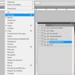
Good, now we organize our layers. First merge the Mid tone layer, with the highlight hair and hat layer. Then we name this Midtone. We also name the shadow layer as “Shadows” as well. It should look something like this:
STEP 8
Now, we have the basics of our portrait image to be turned into typography. We will now create the design in earnest. Press CTRL+N to create a new Photoshop Document. In the window that opens, set the dimensions needed, in this case we will be designing a poster but note that you can also use this effect in postcards and flyers. Remember to use a minimum of 300ppi for the resolution though for your printing.
STEP 9
Next, we paste in our Midtone and Shadow layer unto the new document like so. In the screenshot below, we hid the background so that you know where the transparent parts of the layers are. Of course, some resizing is in order for both layers. With both layers selected press CTRL+T. Hold down the shift key and decrease or increase the size of the layers as needed by dragging the selection boxes.
STEP 10
Next, click on the Shadows layer that we just pasted in. Go to Edit > Fill. On the window that opens set the contents to use “Black”. Change the Blending Mode to “Normal” and make sure that the opacity is set to 100%. Also tick the checkbox for Preserve transparency.
STEP 11
Then, we do the same for the Midtones, but this time we set it to 50% gray.
STEP 12
You should now get some greys for the midtones and black for the shadows. It should look something like this.
STEP 13
Once you are content with the processing of the images. Merge both the Midtone and the Shadows layer together. Do this by selecting both, right clicking on them in the layers panel and selecting “Merge Layers”. This now prepares our poster and our portrait for the typography style. First though, we shall prepare our typography brushes.
STEP 14
Now, create another new document, size it relatively large, but the dimensions do not really matter. Now, using the type tool, type in several different words (in their own layers). Vary their sizes, and their font styles. Make sure though that the color is set to black.
STEP 15
Now, select all of the text layers. Right click on them and select the option “Rasterize Type”. This will change the text from editable vector text to pixel based images. So make sure that you are sure with the text and fonts before you do this. All of these will become our brushes.
STEP 16
Now, we are going to define the text as brushes. Remove the visibility of all other brushes except one. Select that one rasterized text layer and go to Edit > Define Brush present. In the window that opens, name the brush with something you can remember.
STEP 17
Then, just repeat the process for the rest of the text. Make sure that you only make one text layer visible at a time. Once done, if you check out the brush pre-sets by selecting the brush and right clicking on the canvass, you should see our text brushes.
STEP 18
Great! Now, let us go back to our poster design. Once you are back to the poster design, go to the brushes panel (Shortcut F5). Select your first text brush. Click on the Brush Tip item. Then on the spacing area increase the percentage until you have a good distance between each word of the brush. Adjust the settings as you want, for our example, we used a 494% value for the spacing. You may also want to adjust the diameter and angle a bit if needed.
STEP 19
To make sure you have the type of spacing that you need, create a new layer in our design (CTRL+SHIFT+N). Then text the brush out there. Re adjust your brush as necessary. What you are looking for is a brush that has some variety and randomness in the output.
STEP 20
Just fill up the face with the text. Do not worry about going beyond the lines as we will fix that later. However, make sure that you use smaller sized text brushes for the facial features such as the eyes and mouth to get a more refined effect for those features later. After some experimenting and total randomness, you should have something like this.
STEP 21
Good! Now, create a new layer by pressing CTRL+SHIFT+N. Fill this with a white color using the paint bucket tool. Then move this in between the layer with text brushes and our original shadow-midtone layer.
STEP 22
Good, now we shall do a little trick. First hide the white layer and the text brushes layer again, then click on our midtone-shadow layer. Press CTRL+A to select the whole canvass. Then press CTRL+C to copy the contents that are active now in the layer.
STEP 23
Now, turn the visibility back on for the white layer and the brushes layer. Select the text brushes layer and then click on “Add Layer Mask” icon at the bottom of the layers panel.
STEP 24
Now, hold the ALT key and click on the layer mask thumbnail. The screen should turn White. Next, press CTRL+V to paste in our previous selection.
STEP 25
Press CTRL + D to de-select the area we have active. Then press CTRL + I to invert the selection. It should look something like this.
STEP 26
Now, when you click on the actual layer thumbnail and not the layer mask thumbnail, you will get a grunge typography style result.
STEP 27
Now, create a new layer. Then, use larger text brush sizes to add around our main typographic grunge image. If possible try to form some great phrases along the way.
STEP 28
Great! Now we will color our elements. First double-click on our main text brushes layer. The layer styles window should open. When it does, click on the “Gradient Overlay” check box. There, change the color gradient by clicking on the gradient box. Use a 3-5 color gradient of your choice. There are pre-sets already that you can choose from, but of course, you can also choose your own colors.
STEP 29
Once you have chosen your colors and pressed okay, you will have this great color themed result.
STEP 30
Next, just do the same to the upper layer with our larger text brushes. Just double click on the layer and add more gradient colors according to your theme. For this particular design, we used the blue, red and yellow preset. We also adjusted the angle of the gradient to 147 degrees.
FINAL IMAGE
Great! Now you are done with our typographic portrait style poster! Adding more details on the background is optional. Here we just added some subtle rays to make the background a little more interesting. Try these out in your own pictures!
Vía: Irene Thompson


Finalidad » Realizar la gestión administrativa, contable y fiscal, así como enviarle comunicaciones comerciales sobre nuestros productos y servicios, finalidades relacionadas como usuario de los servicios que brindamos en nuestra página web https://www.elrincondelombok.com
Legitimación »
- Ejecución de un contrato.
- Interés legítimo del Responsable.
- Consentimiento del interesado.
Destinatarios » Están previstas cesiones de datos a: Administración públicacon competencia en la materia; organizaciones y empresas relacionadas con el responsable de tratamiento que permitan la prestación de servicio; empresas de comunicación;Derechos » Tiene derecho a acceder, rectificar y suprimir los datos, así como otros derechos, indicados en la información adicional, que puede ejercer enviando un correo electrónico a la dirección de e-mail info@lombokdesign.com
Procedencia » del propio interesado y de nuestra página web https://www.elrincondelombok.com
Información adicional » Puede consultar información adicional y detallada sobre Protección de Datos en nuestra página web: https://www.elrincondelombok.com/politica-de-privacidad/